Public website
Plain-language patient education, condition and treatment paths, visible urgent-care guidance, and a calmer route to the next step.
A client review build combining patient education with privacy-safe, synthetic workflows. It is not connected to Harbor operations and must not receive personal or medical information.
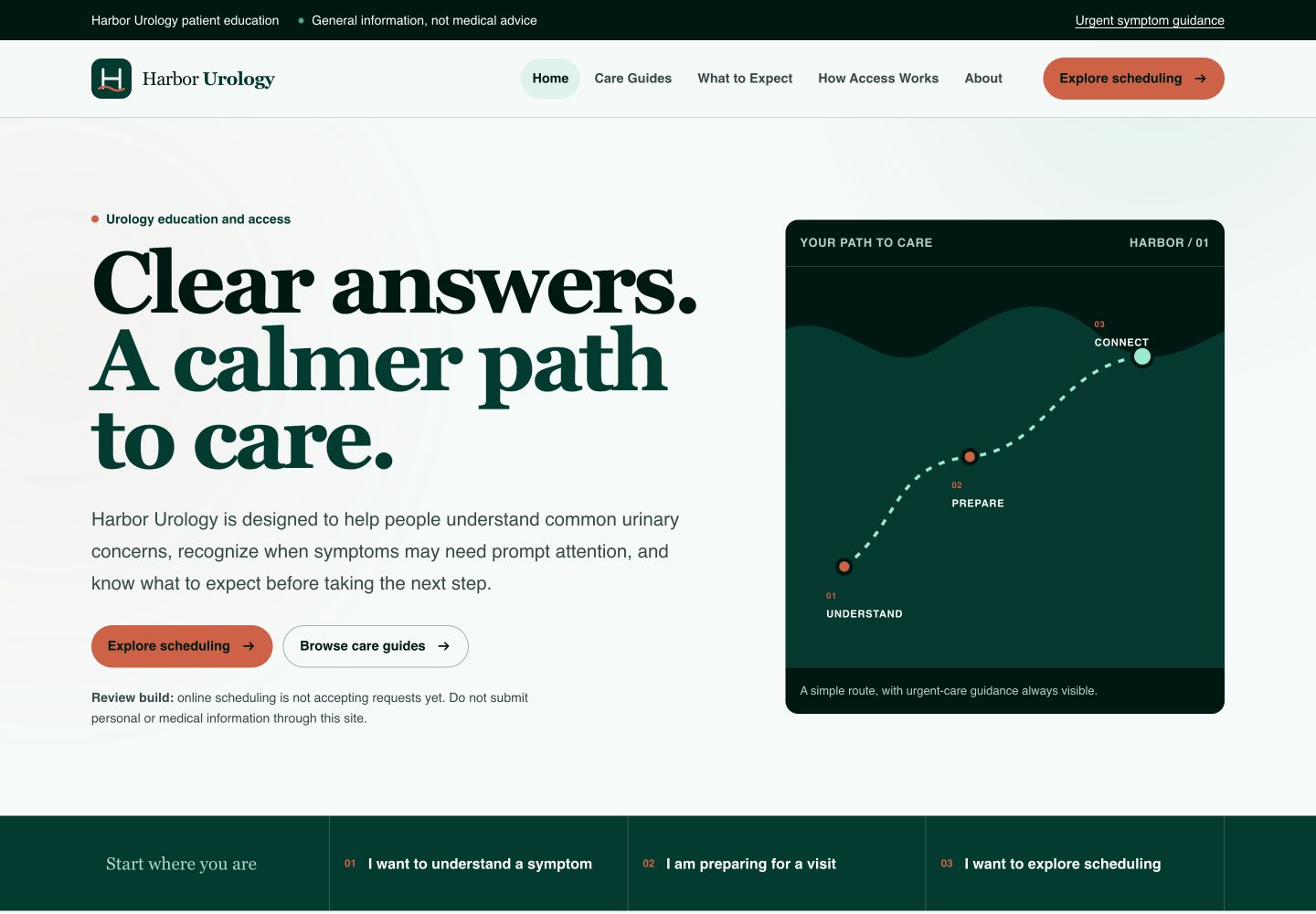
The work extends beyond a brochure site. Front & Function mapped the public experience and the access workflows behind it so the clinic can review message, safety boundaries, patient handoff, and staff operations as one connected program.
Four connected surfaces make the proposed experience concrete without pretending the clinic has launched them.
Plain-language patient education, condition and treatment paths, visible urgent-care guidance, and a calmer route to the next step.
A synthetic scheduling experience that demonstrates service selection, visit timing, and confirmation without collecting real patient information.
A generated request queue with ownership, status changes, and audit history so the operating model can be reviewed before implementation.
A deterministic call path that separates urgent exits from routine follow-up and prepares a cleaner synthetic morning queue.
These screens use generated records and review-only availability. No patient data appears in the portfolio.
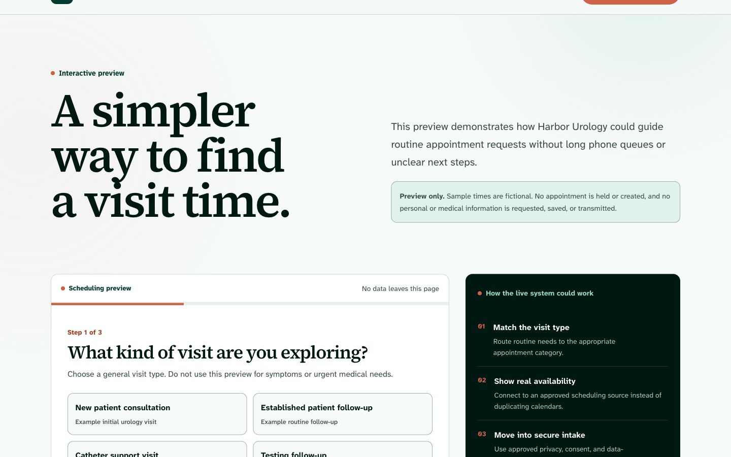
A simple visit-finding flow built for review with generated availability only.
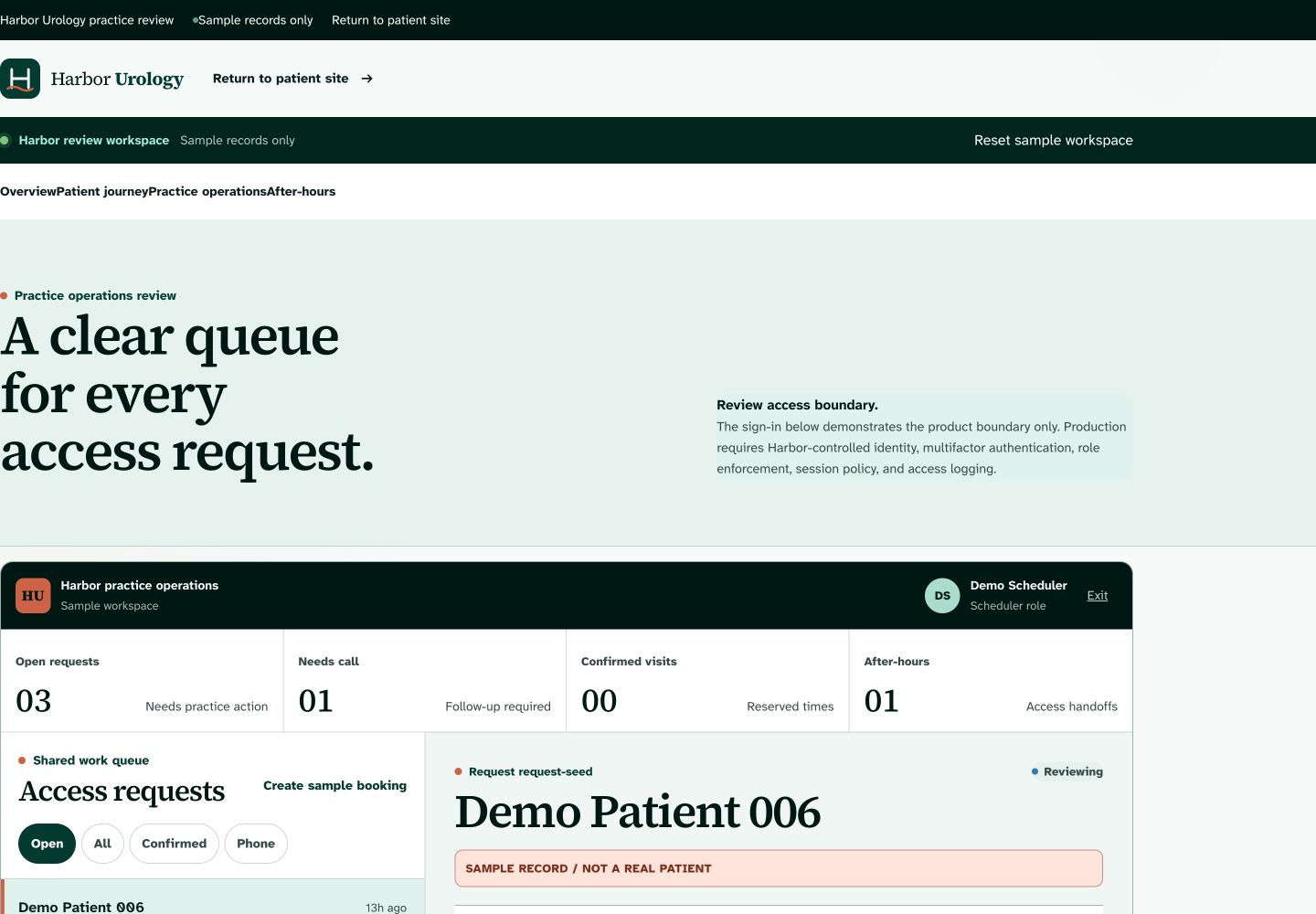
A working synthetic queue used to review assignment, state changes, and operational handoff.
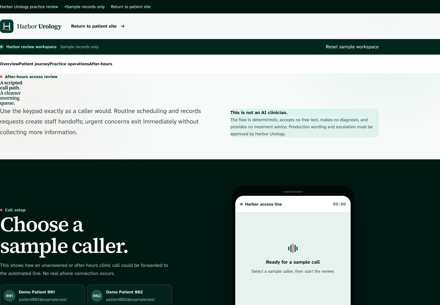
A scripted demonstration of urgent exits, routine capture, and next-day queue preparation.
The brief, strategy, copy, design system, wireframes, demos, safety rules, build handoff, launch gates, and maintenance plan live in the same operating system as the build.
Need a website that connects the customer experience to the work behind it?
Review your digital setup →Browse all website work